
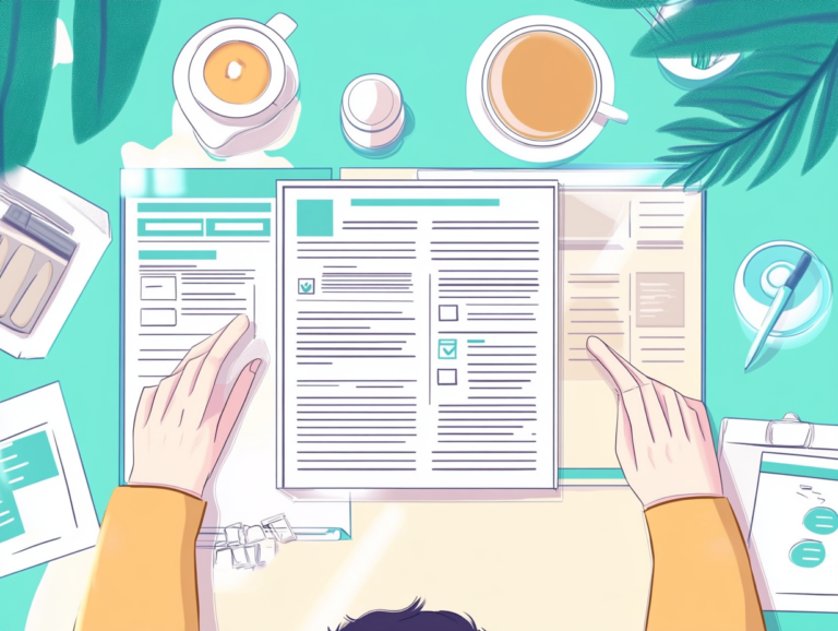
I’ve reviewed thousands of resumes over my career and let me tell you—design matters way more than most people think. A well-designed resume doesn’t just look pretty; it actually helps hiring managers find your qualifications faster and creates a positive first impression. And with recruiters spending an average of just 7.4 seconds on their initial resume scan (not 7 or 8, but 7.4!), those design choices can make or break your chances.
Back in 2010, I created my first “professional” resume using a Word template that made everything look like it was designed in 1997. Yeah, not great. Since then, I’ve learned what actually works through trial and error, feedback from hiring managers and staying on top of evolving resume trends.
In this article, I’ll walk you through the most important design elements that will make your resume both more readable and visually appealing. We’ll cover:
- Typography choices that improve scanning efficiency
- Strategic use of white space and margins
- Color implementation that enhances without overwhelming
- Layout structures that guide the reader’s eye
- Visual hierarchy techniques that highlight your strengths
- Formatting consistency principles
- Digital optimization strategies
Typography: The Foundation of Resume Readability
Font choice isn’t just about looking nice—it fundamentally affects how quickly someone can process your information. The right typography choices make your resume both professional and easy to skim.
Font Selection
Sans-serif fonts (like Arial, Calibri and Helvetica) typically work best for digital reading and modern industries. Their clean lines render well on screens and print clearly even at smaller sizes. Serif fonts (Times New Roman, Garamond) can work in traditional fields like law, banking, or academia, where they signal formality and tradition.
Some of my go-to resume fonts include:
- Calibri – Microsoft’s default for a reason; clean and highly readable
- Arial – Universal and straightforward, never a risky choice
- Helvetica – Classic design favorite with excellent proportions
- Lato – Modern with slightly rounded terminals for a friendly feel
- Garamond – Elegant serif option when you need tradition with readability
Whichever you choose, stick with one primary font family throughout. You might use different weights (bold, regular) or a secondary font for headings, but limit yourself to two fonts max.
Size and Spacing Considerations
Your body text should be between 10-12pt. Anything smaller becomes a strain to read; anything larger eats up valuable space. Headings should be 2-4pt larger than body text (12-16pt) to create clear distinction.
Line spacing (leading) makes a huge difference in readability. Set it between 1-1.15 for body text—tight enough to be space-efficient but open enough to prevent visual crowding. Think of it like this: when lines are too close together, our eyes struggle to track from the end of one line to the beginning of the next.
A 2018 study by the Ladders found that resumes with clear visual hierarchy and appropriate spacing received 60% more attention from recruiters during eye-tracking tests compared to densely packed alternatives.
Letter spacing (tracking) should generally be left at default settings, but slightly tightened tracking can work for headings to create a more polished look.
White Space: The Secret Weapon of Resume Design
I’ve seen so many job seekers try to cram every possible detail onto their resume, creating a wall of text that makes recruiters want to immediately click away. White space isn’t wasted space—it’s a crucial design element that makes your content digestible.
Margins That Work
Keep margins between 0.5″ and 1″ on all sides. Narrower margins (0.5″) maximize space while still providing visual breathing room. Wider margins (0.75-1″) create a more elegant, premium feel but reduce usable space.
One trick I learned from a creative director: slightly wider left and right margins than top and bottom can create a more sophisticated layout without sacrificing much space. Try 0.8″ on sides and 0.6″ on top/bottom.
Paragraph and Section Spacing
Add 6-10pt of space after paragraphs and 10-14pt between sections. This creates visual “chunks” that help recruiters navigate your document. The human brain processes information in groups, so these spacing choices actually help hiring managers remember your qualifications better.
For each job entry, add more space before the company/title than between bullet points. This creates a nested hierarchy that makes skimming much easier—I’ve had recruiters tell me they appreciate this small detail because it helps them quickly identify where each job starts and ends.
Strategic Color Implementation
Color can transform a resume from bland to memorable—or from professional to tacky. The key is restraint and purpose.
Primary and Accent Colors
Stick to a maximum of 2-3 colors total:
- Black or dark gray for main text
- One primary brand color for headings or section dividers
- Optional subtle accent color for small details
Navy blue, deep teal, burgundy and dark green work well as primary colors because they read as professional while still providing visual interest. When I started using a deep navy for my section headings (instead of plain black), I noticed people commented on how “clean” my resume looked—even though that was the only change!
Color Psychology and Industry Alignment
Different industries have different color expectations. Creative fields allow for more color expression, while conservative industries like finance expect minimal color use. Consider these loose industry alignments:
| Industry | Effective Color Choices | Application |
|---|---|---|
| Finance/Banking | Navy, Gray, Burgundy | Minimal use in headings only |
| Technology | Blue, Teal, Green | Section dividers, headings, icons |
| Healthcare | Blue, Green, Purple | Headings, subtle accents |
| Creative Fields | Broader palette | More wide application possible |
When I applied for a marketing position years back, I matched my resume accent color to the company’s brand color. The hiring manager actually mentioned it during my interview—sometimes these small touches really do get noticed!
Layout Structures That Guide the Eye
Your resume layout should create a clear path for the reader to follow. The structure should support—not fight against—the natural reading patterns of hiring managers.
Column Choices
Single-column layouts work best for ATS compatibility and traditional industries. They follow the natural top-to-bottom reading pattern and ensure information is presented in a clear sequence.
Two-column layouts can work well for fitting more information into limited space. Typically, a narrower left column contains contact info and skills, while a wider right column holds experience and education. This works with how we naturally scan documents (in an F-pattern).
Section Organization
The order of your sections should reflect their importance to the specific role. For most professional positions, this hierarchy works well:
- Contact information (always at top)
- Professional summary/profile
- Work experience
- Skills
- Education
- Additional sections (certifications, projects, etc.)
For recent graduates or career changers, education or skills might move up in this hierarchy. The golden rule: put your most relevant qualifications where they’ll be seen first.
I once reorganized my resume to put my project management experience before my general marketing background when applying for a PM role—and started getting callbacks immediately. That small structure change made my relevant experience immediately visible.
Visual Hierarchy Techniques
Visual hierarchy is about making sure the most important stuff stands out first. It’s probably the biggest difference between amateur and professional-looking resumes.
Emphasis Methods
Use these techniques to create clear information hierarchy:
- Size contrast – Larger elements draw attention first
- Weight contrast – Bold text stands out from regular text
- Position – Top-left information gets seen first in Western reading patterns
- Color – Colored elements attract attention before monochrome ones
- Whitespace – Items surrounded by space get more visual focus
Combine these techniques rather than relying on just one. For example, section headings might be both larger AND bold AND colored, while company names might be just bold.
Highlighting Key Achievements
Use visual hierarchy to emphasize your wins. I’ve found the most effective approach is to make job titles and company names stand out clearly, then use bullet points with strong action verbs for achievements.
One technique that’s worked well for me: place your most impressive achievement for each role in the first bullet point and make just that one bullet bold. Recruiters almost always read at least the first bullet, so this ensures they see your biggest win even in a quick scan.
Consistency: The Mark of Professional Design
Nothing screams “amateur” like inconsistent formatting. Professional-looking resumes maintain strict consistency across all similar elements.
Formatting Patterns
Create and stick to consistent patterns for:
- Date formats (MM/YYYY or Month YYYY)
- Bullet point styles (•, ▪, ▸, etc.)
- Heading capitalization (Title Case or UPPERCASE)
- Spacing before/after similar elements
- Alignment (left-aligned text is most readable)
I’ve created dozens of resumes and I always start by setting up these consistency rules before adding any content. It saves tons of time compared to fixing formatting issues later.
Visual Elements and Dividers
Simple visual elements can improve organization without becoming distracting. Consider:
- Thin horizontal lines to separate sections
- Small icons for contact methods (phone, email, LinkedIn)
- Bullet points styled to match your overall design
Keep these elements subtle—they should support your content, not compete with it. When I added simple 0.5pt gray lines between my resume sections, feedback from my designer friend was that it looked “instantly more polished” without being obvious why.
Digital Optimization Strategies
Today’s resumes live digital lives before they ever get printed. Optimizing for both digital viewing and ATS systems is crucial.
ATS Compatibility
Applicant Tracking Systems need to be able to parse your information correctly. These practices help ensure they can:
- Use standard section headings (Experience, Education, Skills)
- Avoid text in headers/footers (many ATS systems ignore these)
- Skip tables, text boxes and complex layouts when possible
- Include keywords from the job description in context
- Save as PDF to preserve formatting (unless Word is specifically requested)
I learned this the hard way—my fancy resume with custom sections labeled “Career Journey” instead of “Experience” kept getting lost in ATS systems. Switching to standard section names immediately improved my response rate.
Screen Readability
Most people will view your resume on screens before paper. To optimize for this reality:
- Ensure sufficient contrast (dark text on light background)
- Use slightly increased line spacing compared to print-only documents
- Test your PDF on different devices to ensure it’s easily readable
- Keep file size reasonable (under 1MB) for easy sharing
I now always send test copies of my resume to my phone before finalizing to make sure it’s readable on smaller screens. You’d be surprised how many hiring managers first view resumes on mobile devices between meetings!
Putting It All Together: The Complete Package
Great resume design isn’t about any single element—it’s about how everything works together to create a document that’s both functional and appealing.
Before and After Examples
The most dramatic resume transformations I’ve seen come from applying multiple principles simultaneously. Common transformations include:
- Replacing dense paragraphs with bulleted achievements
- Adding 15-20% more white space throughout
- Implementing a clear typographic hierarchy
- Introducing one strategic accent color
- Ensuring perfect consistency in all formatting
These changes together can take a resume from being instantly forgettable to immediately impressive. And remarkably, they often don’t reduce the amount of information—just present it more effectively.
Final Readability Check
Before sending your resume anywhere, perform this 7-second test: Show your resume to someone for exactly 7 seconds, then take it away and ask what they remember. If they can recall your name, most recent role and at least one key qualification, your design is working!
This test mimics how recruiters actually interact with your resume in that crucial first scan. I do this check with every resume update and it’s caught several instances where my most important qualifications weren’t standing out clearly enough.
Conclusion: Design as a Strategic Advantage
Resume design isn’t just about aesthetics—it’s a strategic tool that helps you communicate your value more effectively. The best designs blend into the background, letting your qualifications take center stage while quietly making everything more readable and memorable.
Remember that different industries have different expectations and what works for a graphic design position might not work for corporate accounting. The principles remain the same, but their application should be tailored to your specific career context.
If you’re unsure where to start, focus first on the fundamentals: clean typography, sufficient white space, clear hierarchy and perfect consistency. These four elements alone will put your resume ahead of most competition.
Your resume is often your first professional introduction—make sure its design is working for you, not against you. A thoughtfully designed resume doesn’t just look better; it actually gets read more thoroughly and remembered more clearly. And in the competitive job market, that’s an advantage worth having.